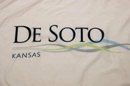
#33 and #32 came in as a tie for Gardner, KS and De Soto,KS both receiving 2.3/10.
DeSoto received complaints about it only being the city’s logo and the wave design being “too indistinct”. However one did say the river and nature lines could be used as a larger element for a future flag.
Gardner’s flag received similar remarks. Comments suggested that it was a nice “G” logo but that the text did not belong. One even wrote, “make the three pixels the main element”.